
Analysing Quandl FX data in R - plotting, decomposing time series, and detecting anomalies
Published:
Quandl is a great source of all sorts of data, and it plugs straight into R. I wanted to have a play with some of it and see what insights I could tease out.
I wrote a short script to pull the British Pound Sterling (GBP) to Polish Złoty (PLN) historic exchange rates from 1996 up to the day I wrote this (4 September 2015).
The first thing I did was load the libraries I’d need: Then I downloaded the exchange rate data from Quandl. It comes in several popular formats (ts, xts, or zoo), each suited to different packages. With the data in hand, I set about cleaning the data frame. The High and Low rate columns had whitespace in their names, which can cause all sorts of headaches in R. I dropped ‘High_est’ and ‘Low_est’ from the xts object to make plotting with dygraphs easier. Thanks to the lubridate package, pulling years, months, and days out of the Date field was straightforward. I also added a ‘Volatility’ column holding the difference between the High and Low rates. With the data cleaned up, I could start plotting. I began by shamelessly borrowing the code for the Reuters-style plot from Quandl’s cheat sheet.
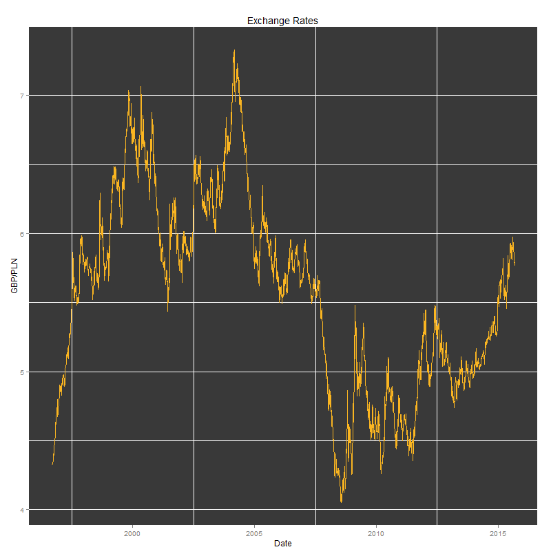
All plots were created using the following code: The results can be seen underneath.
Density plots: 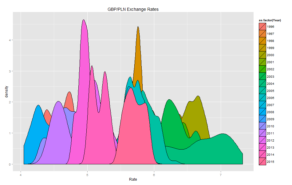
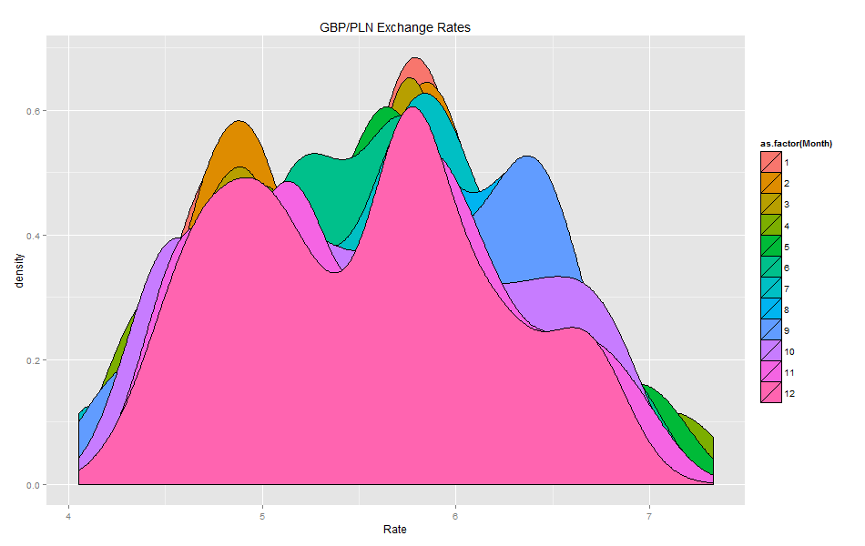
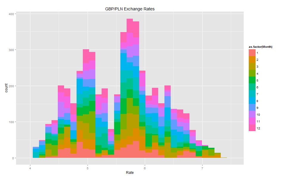
Histograms: 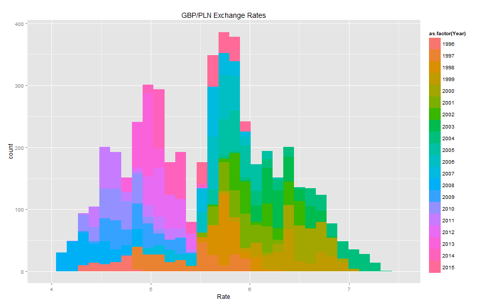
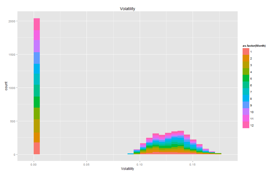
The volatility histogram makes it clear that a lot of fields have missing values.
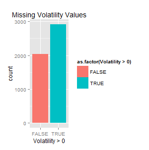
Comparing blank fields against those with non-zero values, the two counts are almost the same. So Volatility is best left alone here — too much of it is missing to be reliable.
The box plots show how the GBP/PLN exchange rate moves across the years and months, along with the mean values and the spread. 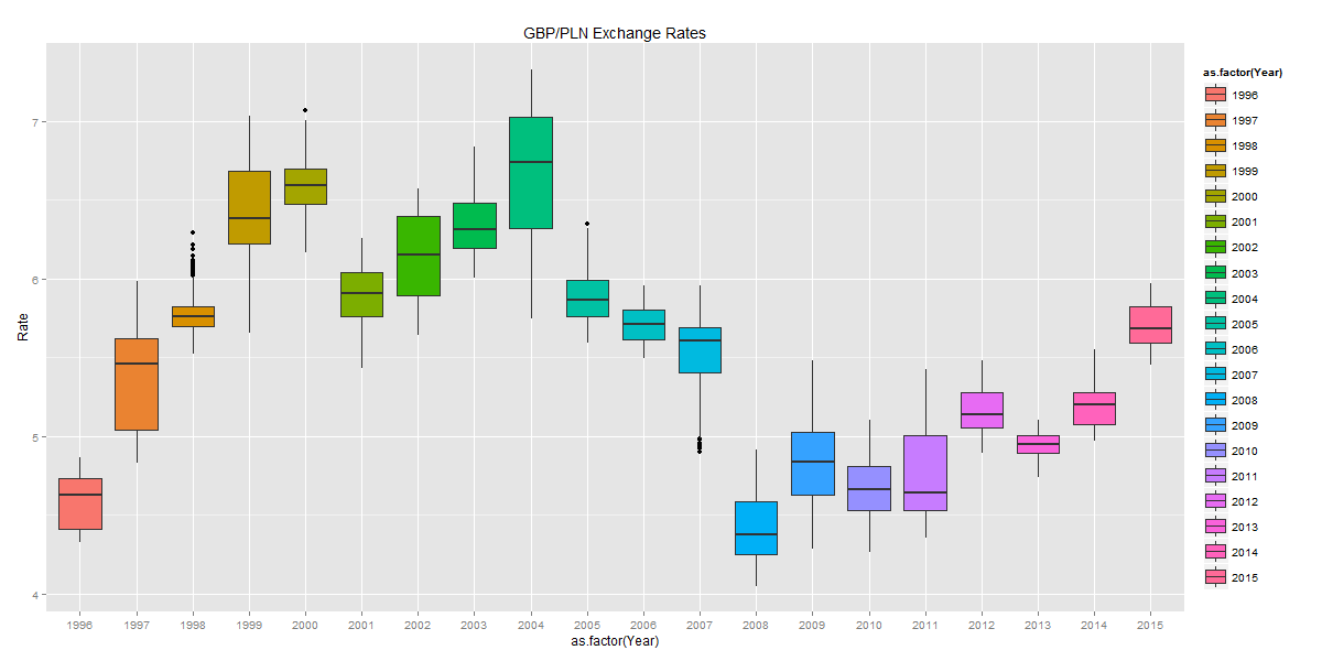
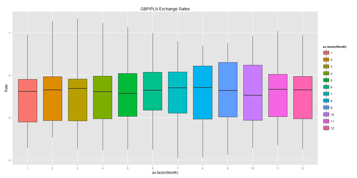
Last but not least is the interactive plot made with the dygraphs package. This one is my favourite, as it lets you explore the underlying data in fine detail (including selecting a date range).
I added event lines for moments that looked relevant to the observed highs and lows of the GBP/PLN rate. Around the time Poland joined the EU, the rate peaked at 7.3 PLN. Four years later, just before Lehman Brothers collapsed, Sterling fell as low as 4.07 PLN.
The interactive plot was created using the following code: Having done enough simple plots, I felt it was time for something more involved. I started with a Seasonal Decomposition of Time Series by Loess, using the stl function.
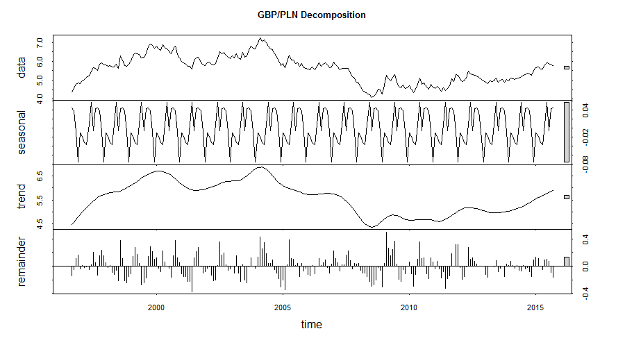
This pulls out the seasonal, trend, and irregular components. The main trend shows GBP appreciating against PLN, while the seasonal component might just hint at a coming correction.
To round things off, I applied the AnomalyDetection package, released by Twitter’s engineering team, to the Quandl data. The idea was to check whether any unusual moves in the exchange rate stood out over the period. This flagged a single anomaly, 7.328 PLN, which was the highest value in the whole series. 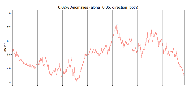
I hope you enjoyed this walkthrough. In future posts I’d like to cover a few more ways to analyse time series.